# UI/UX

# Product Design

# User Research

# User Research

# Product Stategy

# Product Stategy

Unideal

Unideal

Unideal

Duration

3 months

Duration

3 months

Team

Chenchen, Keyu, Steve, Pavlo

Team

Chenchen, Keyu, Steve, Pavlo

My Role

User research, wireframing & prototyping, visual identity, information architecture, partial frontend development

My Role

User research, wireframing & prototyping, visual identity, information architecture, partial frontend development

Overview

Overview

Unideal is a second-hand marketplace designed specifically for students — built around the real friction of moving in and out of unfurnished student housing in Finland.

Unlike generic marketplaces, it focuses on reducing coordination costs around pickup timing, location, and communication.

Unideal is a second-hand marketplace designed specifically for students — built around the real friction of moving in and out of unfurnished student housing in Finland.

Unlike generic marketplaces, it focuses on reducing coordination costs around pickup timing, location, and communication.

Inspiration & Motivation

My Moving Story - Empty Apartment

Inspiration & Motivation

My Moving Story - Empty Apartment

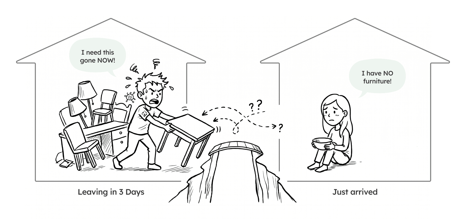
Every semester, thousands of international students are leaving, needing to clear their furniture in days. Simultaneously, new students arrive at empty apartments, desperate for essentials.

I arrived in Finland as an international student to find a completely bare apartment — no bed, no table, nothing.

I spent days in Telegram chats — messaging sellers, losing deals over timing conflicts, and switching to Google Maps just to figure out if a pickup was feasible. The items were there. The process kept failing.

I arrived in Finland as an international student to find a completely bare apartment — no bed, no table, nothing.

I spent days in Telegram chats — messaging sellers, losing deals over timing conflicts, and switching to Google Maps just to figure out if a pickup was feasible. The items were there. The process kept failing.

"The items were there. The buyers and sellers were motivated. The process itself was what kept failing."

Existing Solutions

Current Experience

Existing Solutions

Current Experience

Telegram - Most active trading platform among students

Telegram - Most active trading platform among students

  • No structured product display

  • Unclear item availability (sold or not)

  • Constantly monitor the chat

Tori - Largest trading platform in Finland (Finnish-based)

Tori - Largest trading platform in Finland (Finnish-based)

  • Not friendly to international students

  • No dibs structure

  • Overly complex filter categories not relevant to students

  • No date-based availability filtering

Problems

Why Trading Fails?

Problems

Why Trading Fails?

01

Time

"When can I pick this up?"

Sellers and buyers are often only available for a narrow window — sometimes just a few days. 71% of users cited available dates as a top-3 factor, yet sellers rarely posted this info upfront.

->

What I learned from this?

01

Time

"When can I pick this up?"

Sellers and buyers are often only available for a narrow window — sometimes just a few days. 71% of users cited available dates as a top-3 factor, yet sellers rarely posted this info upfront.

->

What I learned from this?

01

Time

"When can I pick this up?"

Sellers and buyers are often only available for a narrow window — sometimes just a few days. 71% of users cited available dates as a top-3 factor, yet sellers rarely posted this info upfront.

->

What I learned from this?

02

Location

"How far, how long?"

Users constantly switched to Google Maps mid-conversation to check if a pickup was feasible — disrupting the flow. An address and a distance number are not enough for newcomers.

->

What I learned from this?

02

Location

"How far, how long?"

Users constantly switched to Google Maps mid-conversation to check if a pickup was feasible — disrupting the flow. An address and a distance number are not enough for newcomers.

->

What I learned from this?

02

Location

"How far, how long?"

Users constantly switched to Google Maps mid-conversation to check if a pickup was feasible — disrupting the flow. An address and a distance number are not enough for newcomers.

->

What I learned from this?

03

Communication

"What should I do next?"

Expressing interest, agreeing on a price, scheduling pickup, confirming the exchange — all of it happened in the same unstructured chat with no guidance. Users didn't know what steps remained.

->

What I learned from this?

03

Communication

"What should I do next?"

Expressing interest, agreeing on a price, scheduling pickup, confirming the exchange — all of it happened in the same unstructured chat with no guidance. Users didn't know what steps remained.

->

What I learned from this?

03

Communication

"What should I do next?"

Expressing interest, agreeing on a price, scheduling pickup, confirming the exchange — all of it happened in the same unstructured chat with no guidance. Users didn't know what steps remained.

->

What I learned from this?

Design Requirements

What the design had to do?

Design Requirements

What the design had to do?

Date availability upfront

Pickup dates shown prominently on listings and filterable from the search page — not buried in chat

Show travel context

Commute time by metro, bus, and walking — not a raw address or distance number that means nothing to a new student

Guide the transaction

A clear flow from discovery to handoff — no ambiguity about what comes next for buyer or seller
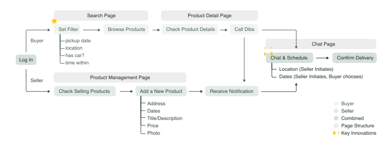
User Flow & Information Architecture

User Flow & Information Architecture

Design & Development

Design & Development

Search Page

Persistent filter, instant context

The search page is the default landing point. The filter panel stays visible while scrolling. Only four filters are offered, each essential: pickup date, location, car option and travel time.

Seller selects availability period when adding product

Product Detailed Page

Decide before you ask

  • The page answers the three questions that matter: what is it, when can I get it, and how do I get there?

  • Tag-style chips replace dense text descriptions.

  • Exact addresses are intentionally withheld. The specific address is coordinated privately in chat, protecting seller privacy while still giving buyers enough to decide.

Chat Page

More than messaging

The chat page embeds the entire transaction flow. On the right panel, a todo list tracks progress — complete payment, schedule time, agree on location, confirm pickup — each step toggling from pending to checked as both parties confirm. A subtle "Undib" button is intentionally de-emphasized to avoid accidental cancellation.

Design Decision

How I think about product

Design Decision

How I think about product

01

Privacy over completeness

CONTEXT

Buyers need location info to decide if pickup is feasible. Sellers — often students in shared housing — are uncomfortable sharing home addresses publicly with strangers.

DECISION

Show commute time by transport mode on the public product page. Defer the exact address to private chat only.

OPTIONS CONSIDERED

Show full address publicly

Show nothing until chat

Travel time only

TRADE-OFF

Exact addresses don't help international students anyway — "Keilaranta 5" / "5 km" are meaningless without context. Travel time does the job without the privacy risk. Privacy became a feature, not a constraint.

02

Todo list over progress bar

03

Date filter before browse

04

"Dibs!" as hard reservation

05

"Sell A New Item" inside the grid

Reflection

What I Learned

Reflection

What I Learned

User empathy & Problem finding

Being the target user gave the design a sharp clarity of purpose — every decision could be tested against a real experience, not a hypothetical persona.

User empathy & Problem finding

Being the target user gave the design a sharp clarity of purpose — every decision could be tested against a real experience, not a hypothetical persona.

Communication skills

Translated abstract design concepts into concrete, implementable requirements for engineers

Development cost as a design input — learned to scope features against build effort

Negotiated feature priority using "technical debt" vs. user experience ROI

Communication skills

Translated abstract design concepts into concrete, implementable requirements for engineers

Development cost as a design input — learned to scope features against build effort

Negotiated feature priority using "technical debt" vs. user experience ROI